- UX & UI Design
El Mundo
Proposal Redesign elmundo.es
Unidad Editorial
UX / UI
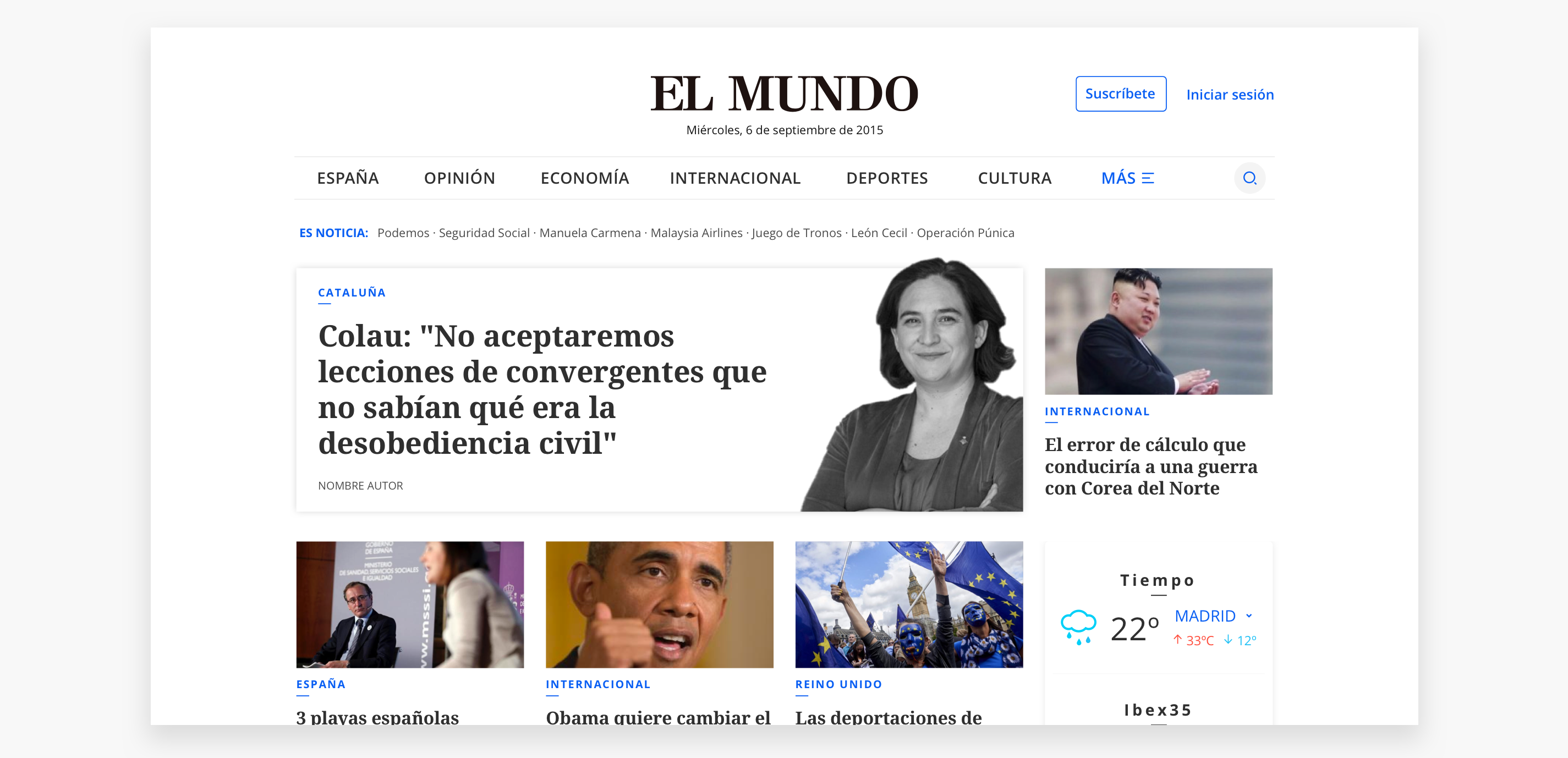
elmundo.es is on of the leading digital media in Spain with around 14K unique users per month
Disclaimer: According to my confidentiality contract I have omitted information. The opinions expressed here are my own and not necessarily reflect the view of Unidad Editorial or any member of the team.
Overview
In 2015, Unidad Editorial started working on a complete digital enhancement. Digital users turn into a major hub as they were growing very fast and the products were not offering the best experience.
Challenge
Create a user-centered proposal for the revamp of "El Mundo.es" enhancing the experience and balancing between business goals, editorial needs and user expectations.
first things, first
USERS
The idea of the whole enhancement was to delivered a better digital experience, what meant to change the complete classical navigation structure (from columns to rows), simplifying everything everywhere from the homepage to the comments, and off course the big premise was to found the best way to deliver news in our most loved device: mobile.
To know the users the first to do was to execute quantitative research mainly heatmaps and web analytics, it was necessary to have a holistic view of the relation product - user and found answers for questions like: how the users were navigating, how do they were consuming news, how long do they stay, how did they jump between sections, where do they get stuck...among some others.
The research was mainly followed up by a colleague researcher, as product team we were working really close with project managers and the development team to get a better view of business requirements and technological issues.
what should we do?
Revamp
As the revamp was a huge task, there were different phases to deliver. The first one were all the navigation system artifacts: header, menu and megamenu (hmm!🤔 I know what you may be thinking, sounds like a mild task but trust me it was tricky). We aimed to keep navigation simple, help the user switch easily between sections - articles - homepage (and even with other newspaper from the group), providing a better content structure, reduce user pains and engage users. The issue was to provide the correct interaction to grant an intuitive and friendly navigation.
The first clues 🕵️
So, we solved our questions + we had business requirements + quantitative data from the first analysis, let's start there. We started by simplifying desktop navigation, it was necessary to remove links, as the main point of entry to sections according to some heatmaps we did, was the homepage, so we kept the most visited elements on the top header and move the rest inside the megamenu. Thinking on a better architecture the edition choice was remove as users were in a high percentage from Spain, moving other editions into international section. The device choose option (desktop - mobile) was removed as the new design would adapt according to the device. On mobile the task was similar, we followed same desktop grouping path but providing access to the menu and the login.
From user interface the goals were to simplify the structure visually, kept it simple but caring for the branding, reduced noise (helping users to focus), established a harmonizing structure, so we started by removing the colors used for sections and that way highlighted the main CTA's. We also proposed a new color palette to have more vibrant colors.
We started prototyping, testing in all possible devices, at the same time our research college was doing interviews to see how users interacted with the new artifacts, so we iterate over and over with that feedback.

the top of tops
Header
Based on user-centered principles, our users feedback and after some team brainstorming & benchmark we wanted to provide some extra information: like the length of an article or the news left to finish a section, to always indicate the section that the user was visiting or to have visible the title when the user was reading an article.
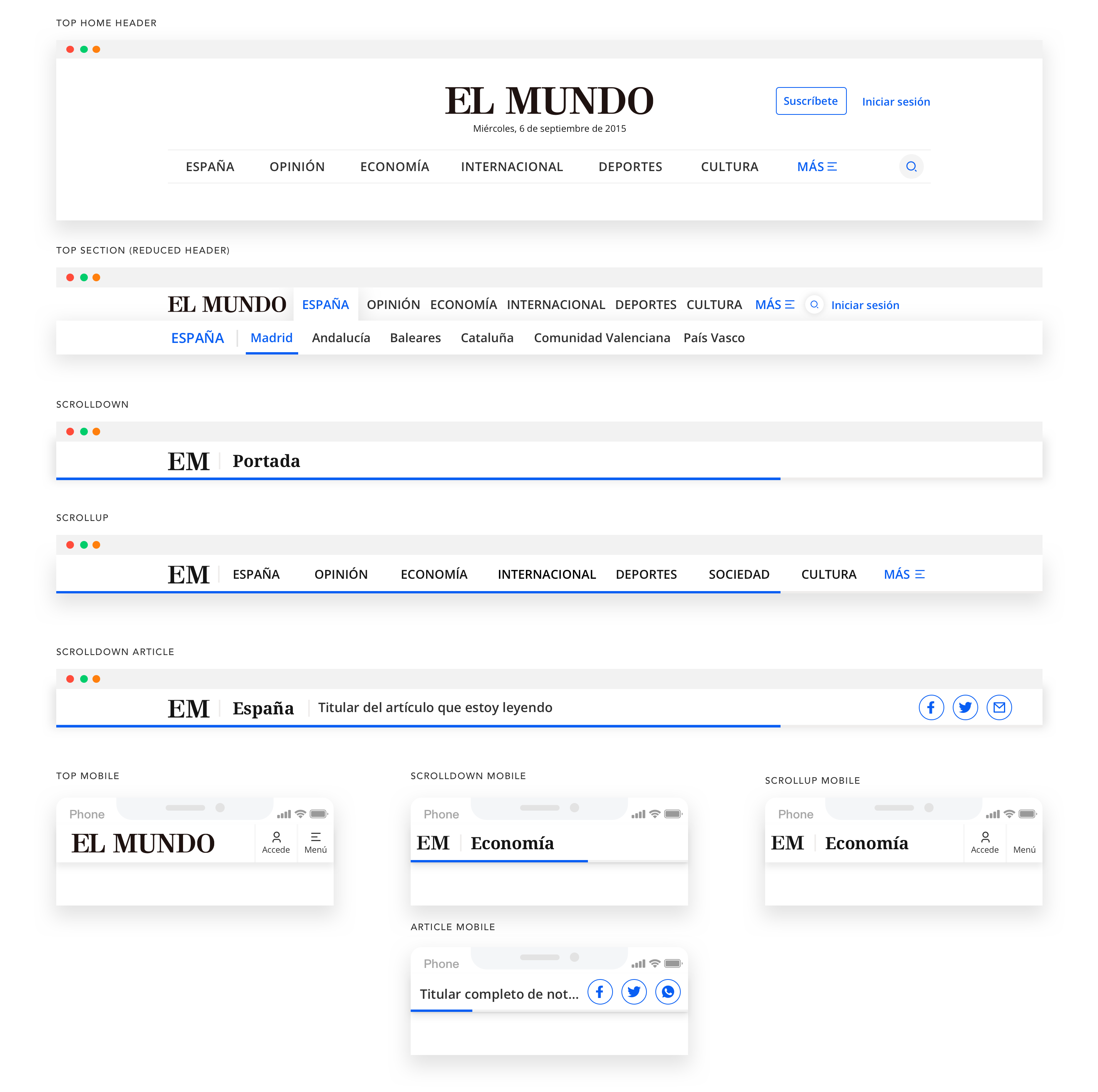
After doing all the steps: understanding, exploring and implementing. We proposed different header interaction status: Top, scrolldown and scroll up.
Top when the user get to the homepage they would see the main header, when arrived to a section will had a header reduction with the subsections visible, on mobile it translated into tabs, in both cases showing the navigation options.
Scrolldown when the user start scrolling will see the name of the current section (same behavior for desktop and mobile), in case of reading and article in desktop would see the "section + the article title+ share options" in mobile would had "the article title+ share options"
Scrollup when the user scroll up they may be looking to go back to the starting point so we showed the main sections (same as main header) so the user can easily switch between sections.
The response from the users was very positive, even nowadays El Mundo has change the design but the header interaction remained the same
Menu
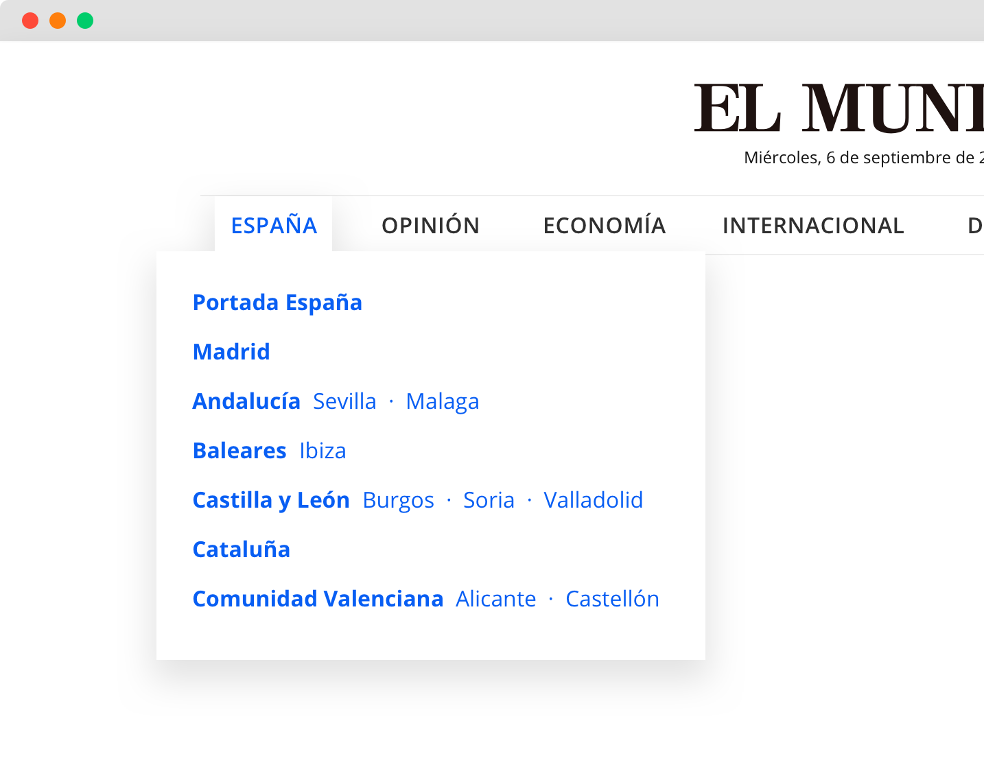
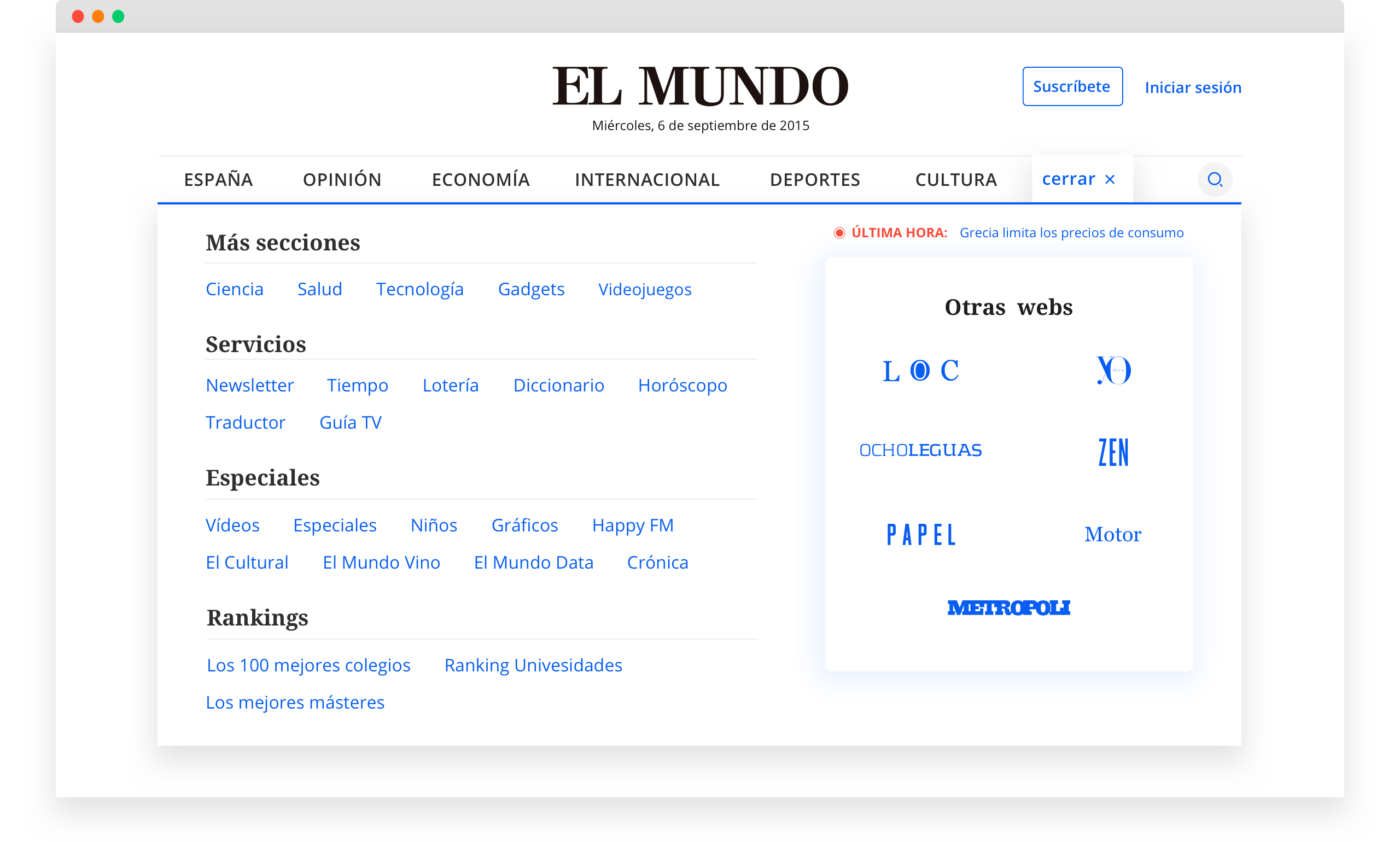
On the menu we wanted to keep visible the different navigation levels
the core of the news
Article
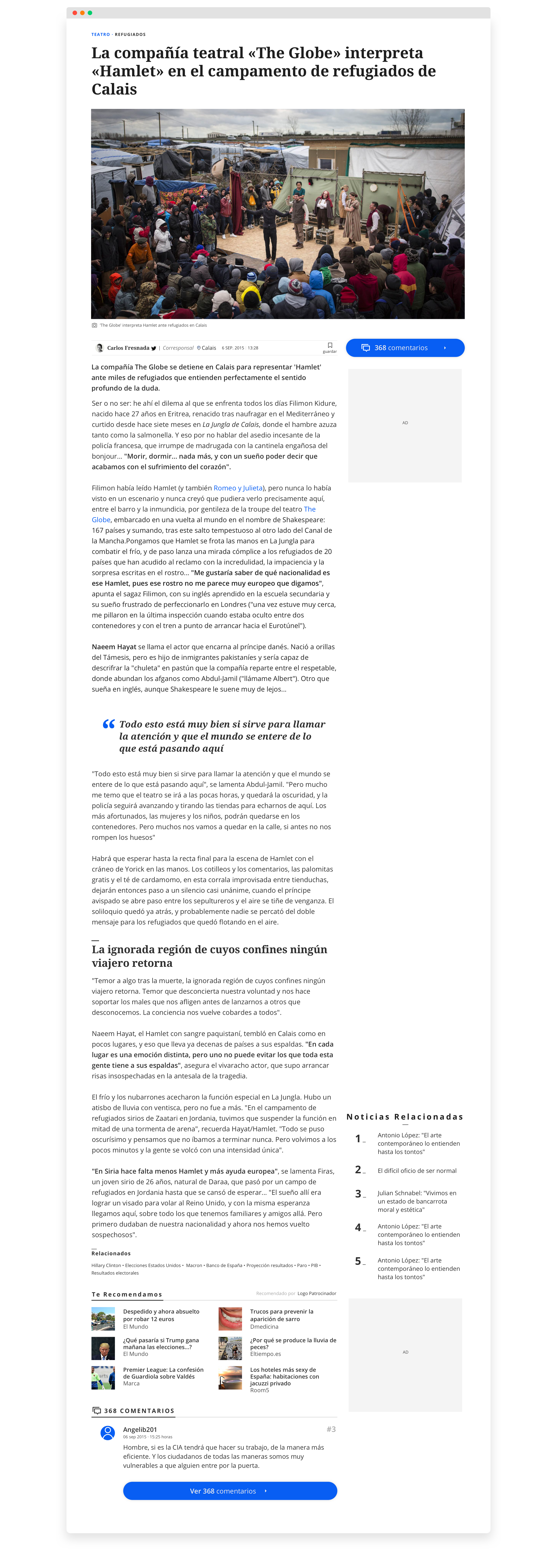
Then came the second artifact: the article. The main points basically remained, simplify content, reduce noise, order CTA's, be user-friendly, give more visibility to editors and rethink the comments.
We started by doing a heuristic evaluation where we highlighted the need to create a hierarchy and let the users focus on what was important "the content" because while they were reading an article they had a lot of elements calling for their attention like: cover page news list, related news, the most read, tags, services, highlighted content, a couple of huge sharing buttons at the top & bottom of an article (🤔 who would shared an article before reading it?).
On the other hand there were elements we were questioning like increased or decrease font size on desktop (by accessibility we increased all sizes, our users were not exactly "millennials" and there was a requirement to make the content more enjoyable), on mobile the browsers already allowed to increase or decrease fonts size, they even had a "reader mode" that changed the page preview and let the user adjust and personalize it accordingly to their own needs. The "send to email" option was not that clicked (as the sharing options were mainly for social media, in case of sharing a URL the user would easily copied), on mobile sharing was also implicit on the browser. The question "do you found it interesting? yes or not" was not giving relevant information, first there were a lot of trolls that complain, second we may better know feedback by social media like twitter and third there was a contact center that shared us feedback and pains from real users, they were a meaningful information source.
Let's get to work after the heuristic evaluation and some data collected through heatmaps, we had insights to started working on. My approach was to work a more user-centered design (which for me had 2 sides: users and editors), make article more visual, personal, readable, simple and with our business line integrated (ads).
1. Visual: I proposed to have the option to use bigger open pictures, I knew not all articles would need it (not daily basis info), but I meant at least to give the editor the option to use it or not, anyways there were a couple of photographers in the media and there was also content that was more "emotional" like all social movements that were happening around the world, the presidential and even local elections, the sports winners...among others.
2. Personal: if the user was logged to had the option to "save news", there could be an interesting article who get it's attention in the morning homepage seeking but didn’t had enough time to read it (plus the homepage updated info a couple of times in the day), this space would help to do a follow up to the comments, that way we could also engage users.
3. Readable & Simple: let the user to focus on the content, reduce noise and action calls, make the content more pleasant by increasing font sizes and white spaces. (On the team there as an expert on accessibility and inclusion who worked directly with devs).
last but not least
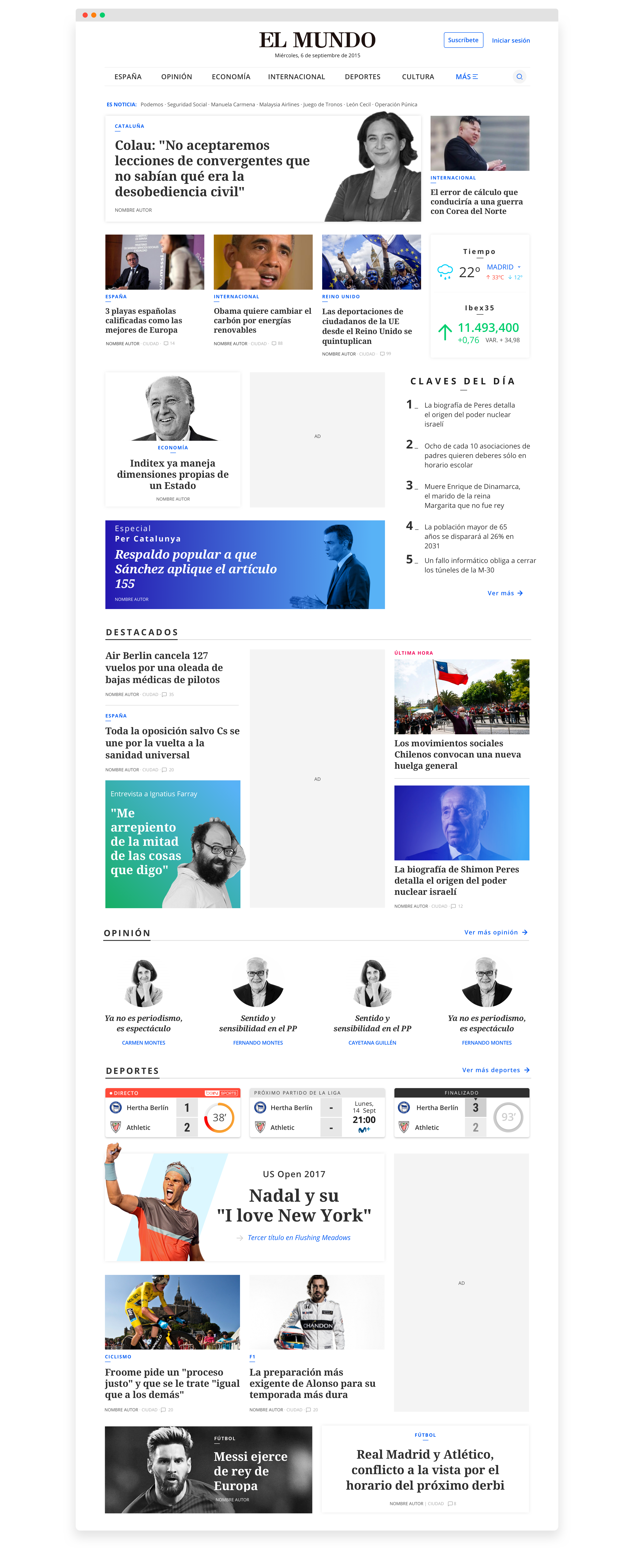
Homepage
Then came the second artifact: the article. The main points basically remained, simplify content, reduce noise, order CTA's, be user-friendly, give more visibility to editors and rethink the comments.
Mobile first rules
Mobile
Then came the second artifact: the article. The main points basically remained, simplify content, reduce noise, order CTA's, be user-friendly, give more visibility to editors and rethink the comments.

